Color plays a crucial role in design, influencing emotions, perceptions, and behaviors. Understanding color psychology helps designers create visually appealing and effective branding, marketing materials, and user interfaces. In this blog, we will explore the impact of colors on human psychology and how to use them strategically in design.
Understanding Color Psychology
Color psychology is the study of how colors affect human emotions and behaviors. Different colors evoke different reactions based on cultural, psychological, and situational factors. By selecting the right color scheme, designers can enhance user experience, drive engagement, and improve conversions.
The Meaning of Colors in Design
1. Red: Passion, Energy, and Urgency
Red is associated with excitement, passion, and urgency. It grabs attention and stimulates action, making it a popular choice for call-to-action buttons and sale promotions. However, excessive use of red can feel overwhelming, so it should be balanced with neutral or softer colors.
2. Blue: Trust, Stability, and Professionalism
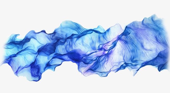
Blue is often linked to trust, calmness, and reliability. It is widely used in corporate branding and tech industries because it conveys professionalism and security. Many banks, social media platforms, and healthcare brands use blue to create a sense of trustworthiness.
3. Yellow: Optimism, Happiness, and Creativity
Yellow is an uplifting and attention-grabbing color that signifies happiness and energy. It is ideal for brands that want to evoke warmth and positivity. However, too much yellow can cause anxiety, so it’s best used in moderation.
4. Green: Growth, Health, and Nature
Green is associated with nature, sustainability, and well-being. It is commonly used in brands related to health, eco-friendly products, and finance. Darker greens convey wealth and stability, while lighter greens represent freshness and tranquility.
5. Orange: Enthusiasm, Confidence, and Playfulness

Orange is a dynamic and energetic color that combines the warmth of red with the cheerfulness of yellow. It is often used in sports, entertainment, and food industries to convey friendliness and excitement.
6. Purple: Luxury, Creativity, and Spirituality
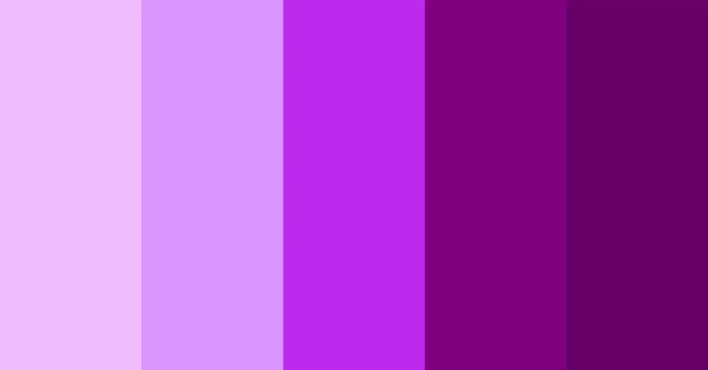
Purple has a royal and mysterious quality, often associated with luxury, wisdom, and creativity. Many beauty, fashion, and artistic brands use purple to create a sophisticated and imaginative feel.
7. Black: Elegance, Power, and Sophistication

Black represents sophistication, power, and exclusivity. It is frequently used in luxury branding, fashion, and high-end products. While black can create a sleek and modern look, too much of it can appear intimidating or heavy.
8. White: Simplicity, Purity, and Minimalism
White conveys cleanliness, simplicity, and elegance. It is widely used in minimalist design, healthcare, and technology industries. White space helps improve readability and creates a sense of openness in designs.
9. Gray: Neutrality, Balance, and Timelessness
Gray is a balanced and neutral color that conveys professionalism and sophistication. It is often used in corporate branding and tech products to create a sleek and modern appearance.
10. Pink: Femininity, Playfulness, and Compassion
Pink is associated with love, nurturing, and playfulness. It is commonly used in beauty, fashion, and children’s products. Lighter pinks are soothing and romantic, while brighter pinks feel energetic and youthful.
How to Use Colors in Design
1. Branding and Logo Design
Choosing the right color for a brand is essential for creating a strong identity. For example:
- Tech companies often use blue (Facebook, LinkedIn, Twitter) to convey trust.
- Fast-food chains use red and yellow (McDonald’s, KFC) to stimulate appetite and urgency.
- Luxury brands use black and gold (Chanel, Rolex) to evoke exclusivity.
2. Website and UI Design
Color influences how users interact with a website or app. Best practices include:
- Using a primary brand color consistently across the site.
- Applying contrasting colors for call-to-action buttons to improve conversions.
- Incorporating white space to enhance readability and user experience.
3. Marketing and Advertising
Colors can drive customer actions in marketing campaigns. For example:
- Red is used for clearance sales to create urgency.
- Green is ideal for eco-friendly product promotions.
- Blue is great for financial services to instill trust and reliability.
4. Interior and Product Design
Color psychology is also essential in product packaging and interior design. For instance:
- Bright and bold colors can make a product stand out on shelves.
- Soft pastels create a calming atmosphere in home decor.
- Dark colors can add a sense of luxury and elegance to product packaging.
5. User Experience (UX) and Customer Engagement
Colors significantly impact user experience and engagement. Understanding how colors affect emotions allows designers to create more effective interfaces. Some key considerations include:
- Using blue and green for calming and soothing experiences in apps.
- Implementing red and orange for high-energy and excitement in gaming applications.
- Choosing neutral tones for professional and corporate platforms.
Cultural and Contextual Considerations
While color psychology is universal to some extent, cultural differences can influence perceptions. For example:
- White symbolizes purity in Western cultures but represents mourning in some Asian countries.
- Red signifies luck and celebration in China but can indicate danger in other regions.
- Green is associated with nature in most cultures but has religious significance in some Middle Eastern countries.
- Yellow may signify positivity in Western cultures but can indicate jealousy or caution in some parts of the world.
Final Thoughts
Understanding the psychology of colors in design allows brands and designers to create meaningful and impactful visuals. By strategically selecting colors based on audience emotions, cultural contexts, and branding goals, designers can enhance user experience, engagement, and conversion rates. Whether you’re designing a logo, website, advertisement, or product, the right color choices can make all the difference.
By staying aware of cultural nuances, utilizing color contrasts effectively, and testing different palettes for optimal impact, designers can harness the true power of colors in the digital and physical world. A deep understanding of color psychology ensures that every design decision contributes to a brand’s success and user satisfaction.